I was reminded of this which I came across while researching how to be a clown. Good old Proust. I remembered it to be much longer though.

_____

1 What is your idea of perfect happiness?
2 What is your greatest fear?
3 What is the trait you most deplore in yourself?
4 What is the trait you most deplore in others?
5 Which living person do you most admire?
6 What is your greatest extravagance?
7 What is your current state of mind?
8 What do you consider the most overrated virtue?
9 On what occasion do you lie?
10 What do you most dislike about your appearance?
11 Which living person do you most despise?
12 What is the quality you most like in a man?
13 What is the quality you most like in a woman?
14 Which words or phrases do you most overuse?
15 What or who is the greatest love of your life?
16 When and where were you happiest?
17 Which talent would you most like to have?
18 If you could change one thing about yourself, what would it be?
19 What do you consider your greatest achievement?
20 If you were to die and come back as a person or a thing, what would it be?
21 Where would you most like to live?
22 What is your most treasured possession?
23 What do you regard as the lowest depth of misery?
24 What is your favorite occupation?
25 What is your most marked characteristic?
26 What do you most value in your friends?
27 Who are your favorite writers?
28 Who is your hero of fiction?
29 Which historical figure do you most identify with?
30 Who are your heroes in real life?
31 What are your favorite names?
32 What is it that you most dislike?
33 What is your greatest regret?
34 How would you like to die?
35 What is your motto?

On February 2004, on my old (Snog Blog 2004 to 2008) I interviewed Vincent Connare about his polarising typeface. More than two decades later, the archives are lost, Forbes and the like jumps on the bandwagon, and thankfully, the wayback machine hoards everything.

Enjoy this interview from 2004.
______

You are sick of Comic Sans. I’m sick of Comic Sans. Why the hell are we still talking about it? Vincent Connare tells us a some things we don’t know about the world’s favourite font, the one designers love to hate and the one which has been discussed ad nauseam.

First up, did you really allow the guys behind the bancomicsans movement to use your picture as a mascot for the movement as they claimed in this issue of How? I remember you griping about it on the MS Typography site.
[Vincent Connare] I got an email from Dave Combes asking to use it. I didn’t answer right away and I didn’t say yes or no. I guess I said do whatever you want meaning if you’ve got nothing better to do with your time I don’t really care.

Tell us about your favourite and least favourite Comic Sans sighting.
[Vincent Connare] My absolute favourite was that at the 2003 ATypI conference in Vancouver, Canada. The lunch bags had Comic Sans on them telling you what was in the bag — the ultimate irony. Then there was the ‘Fun Stamps’ Neon sign I saw years ago over a store in WA state.

Worst use would have to be restaurant menus, or Apple’s iCards. The worst from way back was a Black Sabbath site. And some woman’s site selling her soft porn that gave me credit for the font at the bottom.

Favourite Comic Sans moment?
Laurie Anderson (or her people) called one of the Microsoft program managers and wanted to use it on her interactive CD. I told them give it to her. But I never heard that she used it.

Disney called once and wanted to use it. I said I wanted a signed picture from Mickey Mouse, but didn’t get it. But then my fiancée, a talent agent, called Disney in London and explained the situation and they finally sent me a signed picture from Mickey Mouse, I got it this Christmas!

At ATypI I was LMAO as they say when I saw those bags. There was some university bloke who was presenting lists of numbers and other data about fonts and Comic Sans was listed as one of the most disliked ‘among the designers he interviewed’. Fantastic.

Eminem’s video with Bin Laden has Comic Sans in it.

What is your reaction to all this Comic Sans bashing? How did it feel? As the designer of the font?
[Vincent Connare] People don’t know why it was made. If they did they would realize that it was what design is about —designing for a product with an appropriate design. Not Times New Roman. They also need to pull their heads from their arses.

That’s it? Is this your final answer? How did it feel?
It pisses me off.

Anyone had an over-the-top reaction upon finding out you are the designer of their favourite font?
Yes, sitting at the pub after one of our baseball practices last summer, a new pitcher that had just joined us came up and said “I have to shake your hand. I can’t believe you designed Comic Sans, it’s my favourite font.”

There’s also this musician and writer, represented by my fiancée. He gave her his preliminaries for his next book as a pile of papers about six inches high and it was all in Comic Sans about 500 pages, double-spaced, about 14 point. He said he loved it. I just smiled.

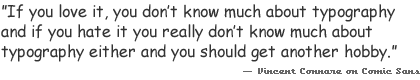
There are hundreds of stories of people saying things like that. I figure it says a lot about someone. If you love it, you don’t know much about typography and if you hate it you really don’t know much about typography either and you should get another hobby.

You have always maintained that it is inappropriate use that makes Comic Sans “bad”. What do you say to those who say that Comic Sans is just bad, no matter how it’s used?
[Vincent Connare] I usually say chose something else. I didn’t include it in Windows, if you want the real story just ask, and go out get a girlfriend/boyfriend and a life.

Designers can be pathetic. Some don’t understand being practical.

So is typography your life or a job for you?
I’m getting sick of the ponces in typography, the hypocrisy is outrageous.

Vincent Connare pixelatedAny theories on why the movement hasn’t run its course? Are there any fonts which you would like to ban?
[Vincent Connare] I think they should ban Apple. First they name their company after the Beatle’s label. Then they release ‘sosumi’ as a sound saying it isn’t music ‘so sue me’ and it doesn’t violate the contract with Apple Music. Now their best-selling product is music.

They chose Microsoft core fonts as its iCard web fonts. Then it released Chalkboard eight years later and it looks to even professionals I sent it to like a copy of the style of Comic Sans. Welcome to the ban wagon.

Do you see the funny side of all these? Does this tickle you?
[Vincent Connare] Yeh it’s all quite funny and I just saw Carol Vorderman on Countdown about an hour ago.

You have designed Trebuchet, Comic Sans, Magpie and Fabula. If you could only pick one font to be known for, which one would it be? And why?
[Vincent Connare] I have to say Magpie since I had the time to research what I really wanted to do and not just make a font that solved a Microsoft issue.

Have you learnt anything from this Comic Sans incident?
[Vincent Connare] Not really anything other than that designers can’t make a font as popular, no matter how high a horse they want to ride. Sometimes the common man just doesn’t like what they like.

_____

The internet was a different beast then. There were no exploitative algorithms, and more humans than bots. If you read the original version on the way back machine, you can see Vincent, Hrant, Dave Combs, etc getting into a debate about the use of his image. It was a nice time to be blogging.

In the depths of an episode it is impossible to write. It hurts to much to write. One can barely breathe without the assistance some impossible weight on the chest, usually strong hands on a cushion. And writing involves breathing and hands. For me dictating is out of the question. I have never been the talking type.

So when the four flavours of fear were fresh in my mind, they were also terrifying and not the kind of thing you’d want to revisit. But I am getting a sneaking then settling suspicion that fluoxetine changes me almost completely.

But first the flavours, in the order that I experienced them.

  1. The b-flick one. It feels like a scare tactic in a cheap horror movie.  The one that jumps out of nowhere and punches you in the face several times a day. This was the worst of them all. Whereas previously I experienced anxiety as a kind of passive worry, this was aggressive and sneaky. It’ll come from nowhere or maybe it’s triggered by the everyday — just the thought that these are the last days of normalcy / happiness. Or it could even be triggered by memories, even happy ones, the thought that those days are over forever. Or as I imagined, “Mom is dead, but her corpse is displayed in the living room.”
  2. The one that feels like a free fall, the vertiginous one. Some people describe this as a feeling of rocking back on two legs of a chair and it’s the moment when you know you’re falling. I think it is far worse than that. No part of you is on the ground, and there is a much longer way to fall.
  3. The alarm clock. I get awakened by a scare attack every morning. It happens usually around 4am in the morning and then maybe again at 7 or so. It feels like a very disruptive / unpleasant wake-up call, a reminder that all your problems are still here and have gone nowhere — thanks, I really needed that.
  4. The delayed cold sweat. This one is the mildest of them all. It feels like the benzes leaving your body. I experienced it after a few weeks after I restarted on 30mg fluoxetine. It is similar to an early morning panic wake-up call. But much milder and very physical. It feels like some kind of cold sweat that moves through you from head to toe. Shortly after this the attacks subsided.
  5. Edited to add: There’s a fifth one that’s more intellectual than the rest. The thought that all the shit is going to hit the fan at the same time, the rock and the hard place are closing in, and the only way out is down.

Details are forgotten, for better or worse. Emotions are blunted. It is how it becomes possible to write about it. I am not a fearless correspondent who can report from the trenches, while bargaining with God, Buddha and neurochemicals.

Edited to add: I need to add an edit link to each post. It’s not possible with the Hello Theme so I’ll have to use some code snippet, I believe.

Behind the Typeface may be old news, but there hasn’t been an interview on the making of the video, so I thought I’d do an email interview with Cheshire Dave, the writer/director of this cult favourite.

How did the idea of making this “Behind the typeface” clip come to you?
I wanted to do something special to commemorate the first birthday of the journal. I also wanted to do something that would draw more attention to Mastication. Ernie Hsiung, a blogger whose site I’ve frequented for a long time would put together these intricate web-games on his site featuring live players, involving what appeared to be a massive amount of work both programming the games and managing them while they were happening. I was impressed that he would do something so involved to entertain his readers. I was also impressed by the things Ze Frank was doing on his site � extremely inventive projects. So I tried to think of something I could do that would be entertaining like that, still hewing to my goal with the journal of doing in-depth pieces.

At first I thought about doing some sort of web-game about typefaces, but around that time I read an essay Matt Haughey had written about the development of Blogger in a “Behind the Music” sort of way. Sometime after that, in the middle of the night, the idea of doing a similar parody � but about a typeface � popped into my head, and I couldn’t fall asleep that night, I was so excited about it.

Why Cooper Black? What were some other typefaces considered? Wouldn’t someone like Helvetica or the maligned Comic Sans have a more interesting story?
Actually, the movie was originally going to be about Hobo, just because I thought it was such a ridiculous typeface. But I was telling my then-housemate about it, and she suggested Cooper Black. She used to work in a T-shirt shop as a teenager and used to have to put on custom shirts.

When I started looking into Cooper Black’s history, I realized that he really did have a story that fit perfectly into the “Behind the Music” mold. So Hobo, who, it turned out, wasn’t a 1960s or 70s creation but was actually a contemporary of Cooper Black’s, got moved into a supporting role.

Helvetica certainly has been influential, and I may consider it in the future. Comic Sans, on the other hand, is slated to play a virus in a different movie I have in mind. It’s not maligned, it’s malignant.

After seeing your clip, I noticed some similar stuff on Keith Tam’s website and Armin’s Speak Up about the same typeface. What’s the story there? Is there some kind of revival going on?
It amazed me to learn how many Oz Cooper fans there are out there. Oz Cooper is a revered figure, and Cooper Black, I think, is considered a typeface that has suffered terrible abuse. There are a number of people who want to redeem Cooper Black.

Keith’s presentation looks like scans from Barnhart Brothers & Spindler’s initial marketing of the Cooper Oldstyle family, mixed with narration from a critical essay I haven’t seen. Kent Lew was nice enough to send me a couple of scans from the same marketing piece, which I used in the revision of my movie.

Armin’s movie is beautiful and bizarre. I like the way he thinks.

Did Cooper ever fall in love?
He had a brief fling with Korinna in the heady days of the 1970s, but she was obviously too young for him, and that kind of thing doesn’t usually last. She was a hottie, though.

How much money / time did you spend on making the movie and what sort of equipment did you use? Anything interesting happened during production?
I spent about three months working on it, for a total of maybe 100 hours or so. I didn’t keep very good track of my time, as usual. It didn’t cost anything to make, but it cost me hundreds of dollars in bandwidth. Luckily, I had some donations that covered about a quarter of my costs, and even more fortunately, Veer stepped in and took over the hosting, bless their hearts. They’ve got an exclusive on my next movie, when I get a chance to make it.

I basically made the movie on my G3 Powerbook, using Flash 5, Illustrator, Photoshop, and SoundEdit 16. I used a standard Mac microphone, the kind that used to come with Macs in the early 90s when Apple was toying with speech commands. I finished constructing the movie on a G4 tower, which was better at crunching such a big Flash movie.

As for interesting things during production:
Sarah, my girlfriend (who is now my fiancee), had just finished law school at that time and had access to a legal database and was able to find the court cases referenced in the movie. That was a great help in adding weight to the movie. Primary sources rock.

It was also helpful to find a big Cooper Black fan pretty much right in my backyard. For a presentation he was putting together, Mike Kohnke had driven around snapping pictures of Cooper Black in action, which is where a lot of the images in the movie come from.

I had originally planned on doing all the voices myself, but I quickly found out that I didn’t have the chops for it. So I recruited friends who are actors in the theater company I’m part of, as well as Sarah and an old friend of mine. I had to learn quickly how to be a director.

Tell us about your next movie(s).
I don’t want to give away too much at this point, but it’s going to be a noir-supernatural thriller, and after viewing it no one’s video store experience will ever be the same.

And I do have an idea for another “Behind the Typeface,” featuring a typeface that had a good run in the 80s and 90s but was just recently forced into retirement. But that’s way down the road, though, I think.

Alliteration is the lowest form of literary devices.

M&Ms which also goes together like a horse and carriage.

August always brings with it an unGodly terror. This year it is much worse.

“Try not to make a big deal out of it.”

This too shall pass.

In my experience it does pass, only to come back later, darker, undeadlier. And later means with less time, less options, less everything to deal with it. Off medication it is completely unbearable. On medication, dealing with it seems to be unglorified procrastination of sorts: “one day at a time.”

The cat is out of the bag. The doctors are either lying or they don’t know what they are talking about. Medication changes everything. The important shifts out of focus. The urgency is gone. The unacceptable becomes bearable. What used to feel like torture seems like something you can work with after all. Why shouldn’t I choose happiness? What’s so important about being authentic? And how do I know what my authenticity is?

Some work that was previously rejected.

Despite it being rejected, I can’t help but feel my heart bursting at creating something so beautiful.

“The beauty is the experimental proof that the incarnation is possible.”

karen does nothing

Search
March 2026
M T W T F S S
 1
2345678
9101112131415
16171819202122
23242526272829
3031  

Archives